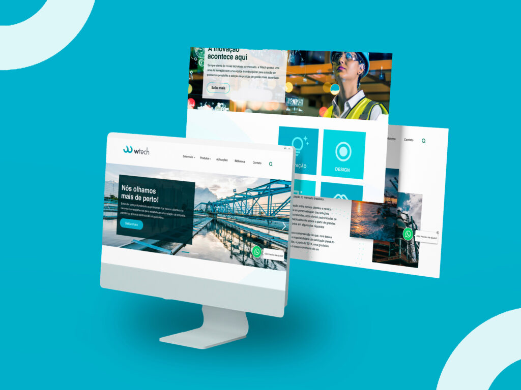
Redesigning an institutional website to be a contact point
W-tech is an Urban Sanitation company that offers specialized services and products for the area. The customer’s problem was related to the website, which had an archaic layout in addition to being incomplete and confusing. According to the company’s CEO, the team was afraid to disclose the old site because it could discredit the company.
Objective Full redesign of the website, creating a layout to function as a showcase for the company and a contact point for customers for lately, convert it into sales.
Responsibilities Conduct customer meetings, user tests and execution of the UX steps.
Problem The oldest website was very confusing and not functional to the users.
Role Research UX Design UI Design Colab. with Dev. team
My Approach:
1. Kickoff with the client to collect insights and do a business canvas;
2. Analyze the client’s website to find UI problems and collect insights;
3. Benchmarking;
4. Solutions
5.Synthesizing insights and prioritization (2×2 matrix);
6. Wireframes
7. UI Design
8. Usability tests
9. Iteration
10. Final designs
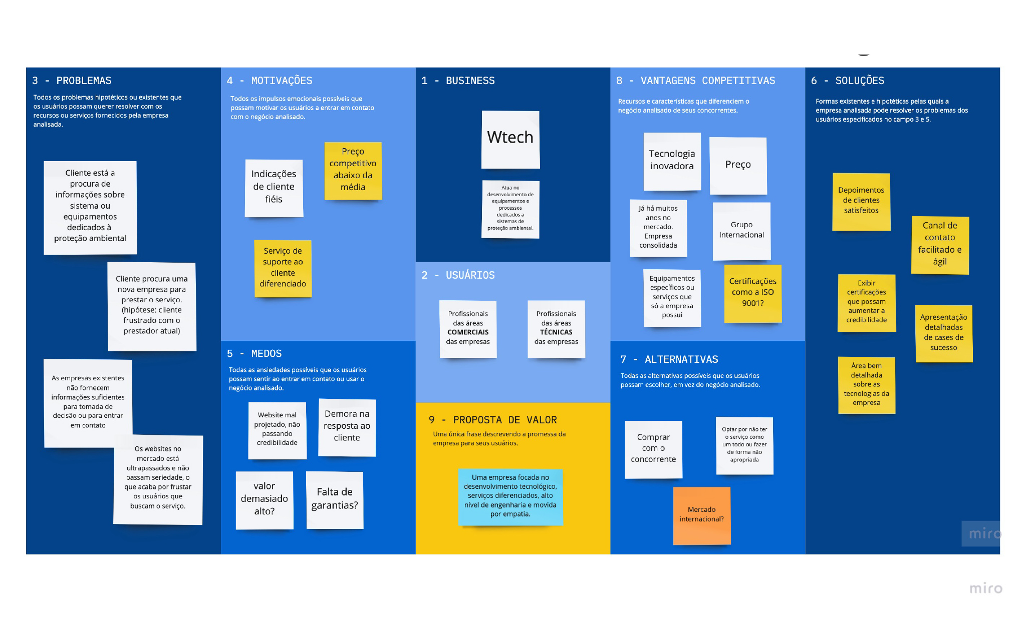
1. Business canvas
To better understand the needs of the client and the project, some kickoff meetings were held so that we could gather insights, understand the complexity of the job and thus choose the best approach. At this stage, the business canvas was also assembled with the customer.
Business Canvas is an essential tool because it helps to understand the target user, adjust the business to market needs, improve the brand’s communication strategy, determine the competitive advantages, and create a value proposition. Using Canvas the company can remain competitive and relevant and gain an engaged and loyal audience.
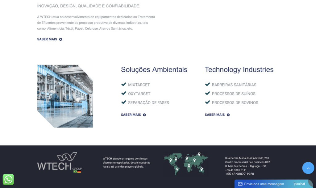
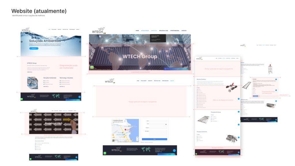
2. Analyzing the client’s old website
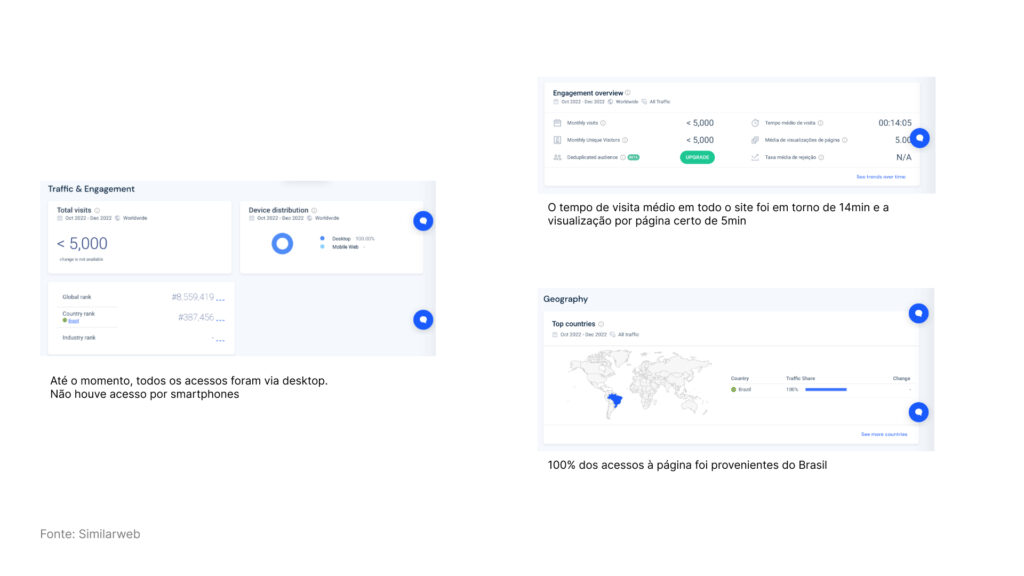
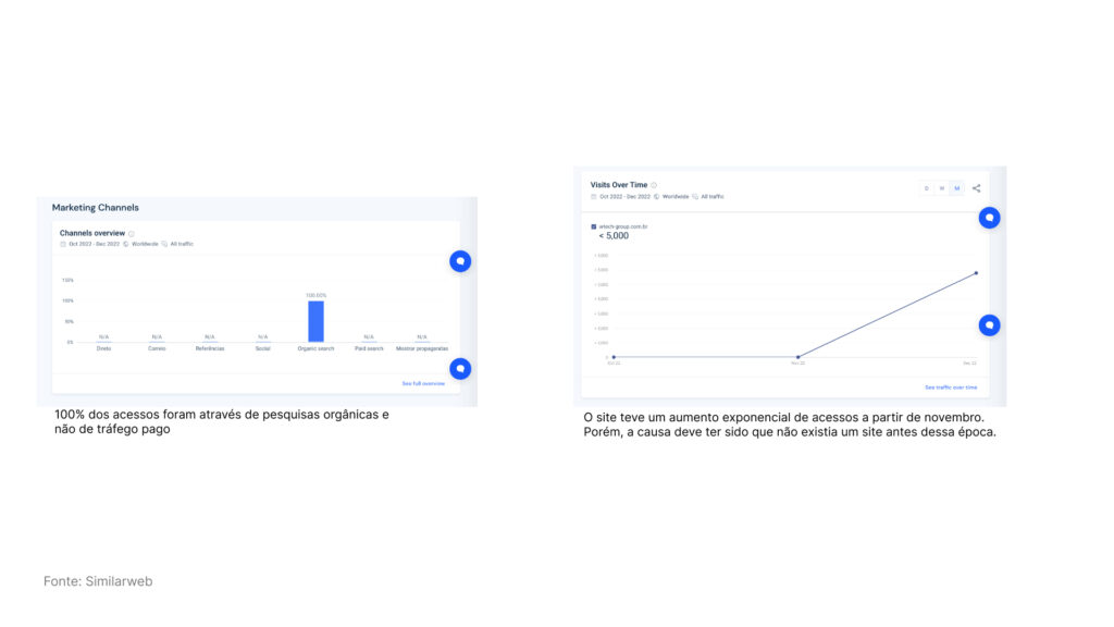
Wtech’s old website was quite old anyway having been built in 2022. The pages were broken, confusing, and incomplete modules. Therefore, we restructure everything. And as the client has been inserted for a long time in the market, this helped us in understanding the target audience and saved time. That’s why, this project didn’t get around to creating personas, and the usability tests were also carried out after a high-fidelity stage.
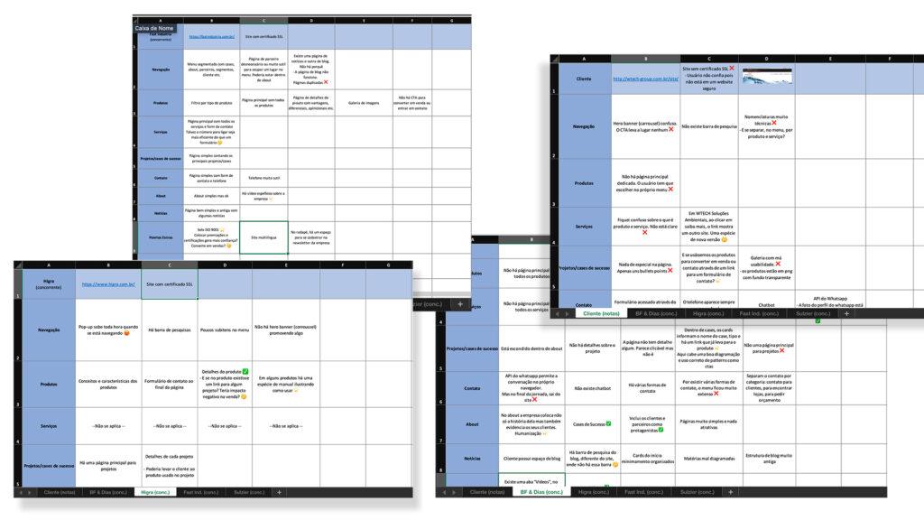
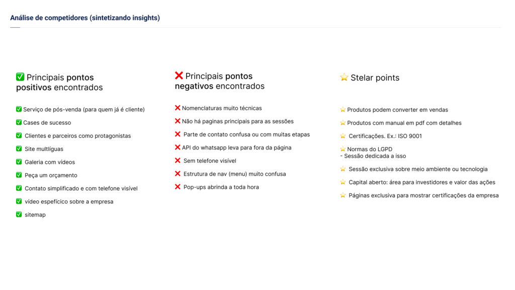
3. Benchmarking
Several analyzes were carried out looking not only for Wtech but also for its competitors, to identify the points positives, negatives, and special points (stellar points)
With this in hand, we have a parameter of comparison and we can identify improvement opportunities.
4. Solutions
In the project, the initial goals were to turn the website into a point of contact and information for customers, and later into an entry point and showcase for the company. It was important that the website conveyed trust and credibility to convert visitors into future sales. Therefore, I prioritized insights that aligned with these objectives. So, I have decided to propose the following solutions:
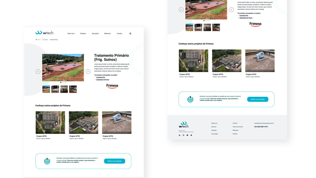
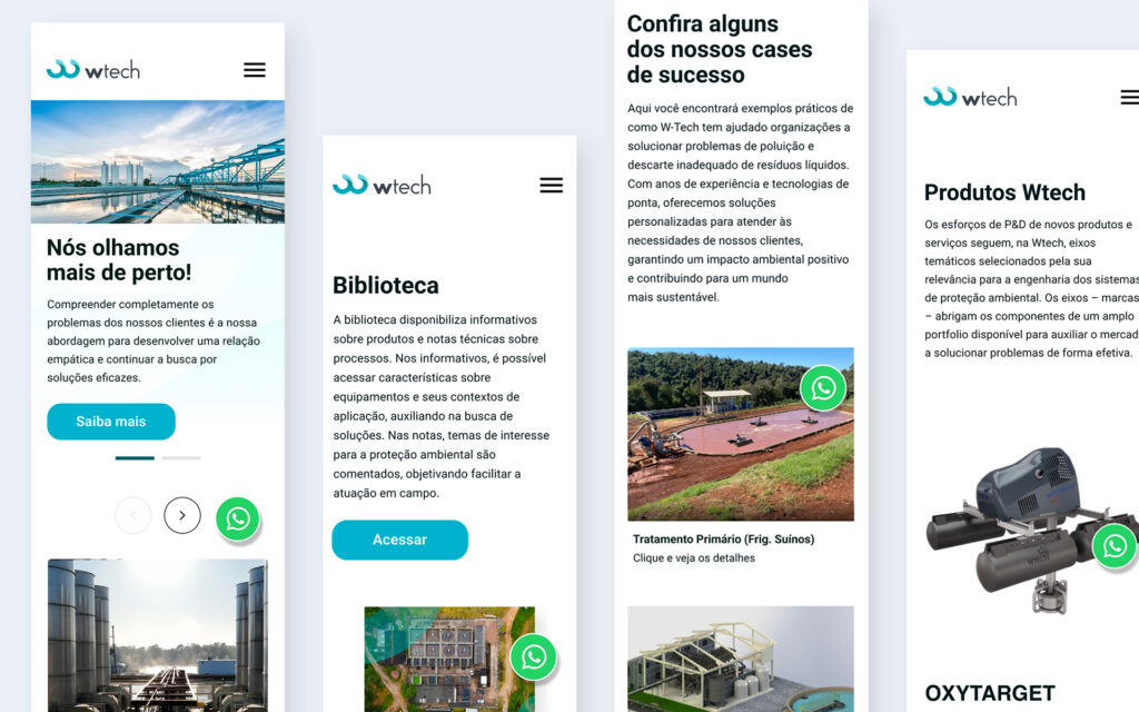
Create a page dedicated to the client’s success cases, as it is possible to validate what was shown on the product page. Additionally, it is easier for the user to visualize the services offered, seeing real photos of real projects with large companies.
To develop a PDF materials library that allows users to learn more about our client’s technologies and stay up-to-date on new success stories and case studies.
Making the phone number visible was important as we knew users were more likely to call or email rather than using the contact form on the website. The previous design did not include contact information such as the phone number and email, so I decided to prioritize them in the footer and contact page.
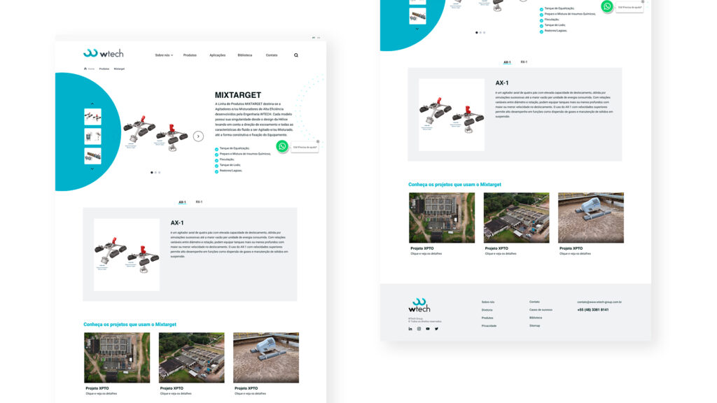
Redesign of the product page. According to the conducted research, the product page was identified as an extremely important page, as it contains crucial technical information that helps the user to identify the value of the client’s products.
5. Prioritization (2×2 matrix)
To prioritize the insights, the 2×2 matrix was used with stakeholders and the development team to decide what we should implement in the product.
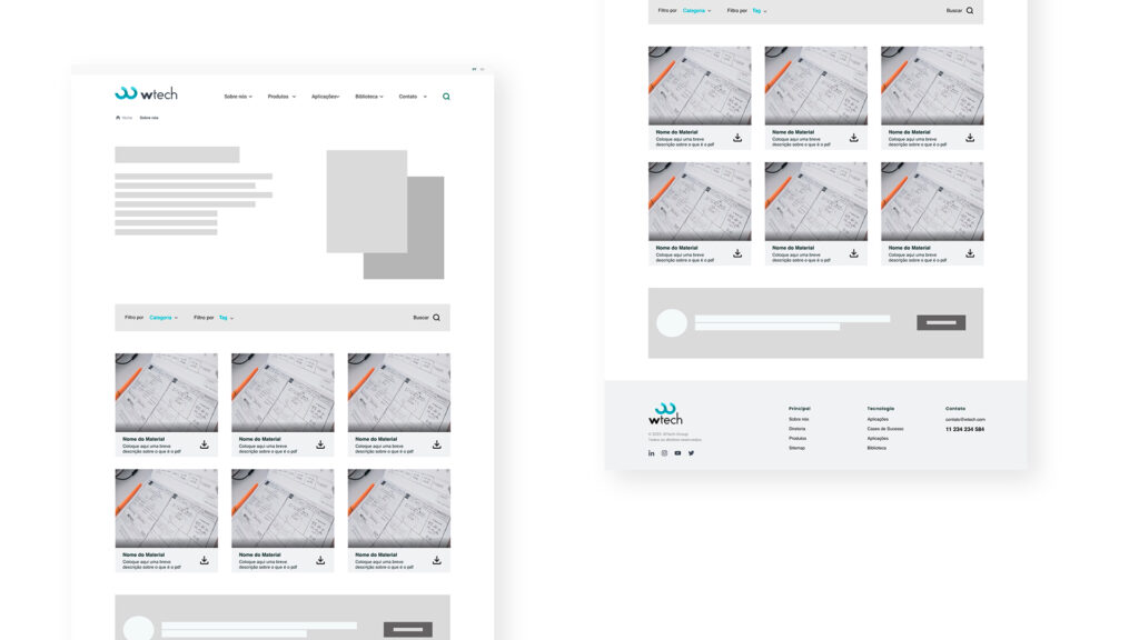
6. Wireframes
In the process of creating a project, I usually go through three important stages for the design development: sketches, rough frames, and wireframes. Each of these stages is essential to achieve a well-crafted final product with good usability.
However, in some cases, as it was in this particular project, the deadline was tight, and there was a need to deliver the designs in a shorter period. Additionally, meetings with the client had already provided valuable insights that helped to define the product’s main functionalities.
For these reasons, I decided to start directly with low-fidelity wireframes, skipping the sketches and rough frames stages. This allowed me to focus on the essentials and create a functional product quickly.
Thus, even though I opted to begin with low-fidelity wireframes in this specific project, I acknowledge the importance of all stages in the design creation process and always aim to use them in my projects when time and circumstances allow.
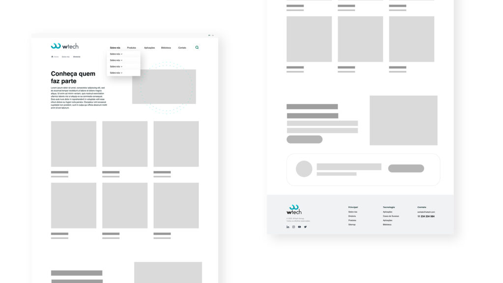
7. Ui Design
In addition to the stages of sketches, wireframes, and low-fidelity prototypes, another important phase in the design process is conducting user testing before moving on to high-fidelity designs. This way, it is easier to make any necessary changes.
However, for this website, the deadline was tight, and there was a need to present high-fidelity designs as quickly as possible. Despite being aware of the importance of user testing, I decided that it was necessary to prioritize high-fidelity design to meet the client’s expectations.
It is worth noting that this was a particularity of this specific project, and in other projects, I usually conduct user testing before creating final designs. However, in this case, the idea was to conduct user testing in the next phase after presenting the high-fidelity designs.
Microiterations: Most of them are intended solely for the desktop version, as according to the research presented in topic 2 on this page, all users access the website through desktops.
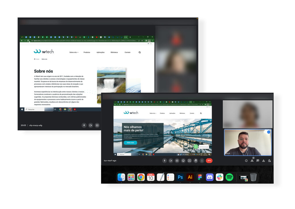
8. Usability tests
After completing the high-fidelity designs and presenting them to the stakeholders, we proceeded to conduct usability tests with three users on the prototype. This was an essential step to ensure that the final product would meet the user’s needs.
The usability tests were conducted on the high-fidelity prototype that had been approved, and it helped identify areas for improvement and obtain valuable feedback from users, allowing us to make necessary changes before launching the final product.
9. Iteration
In the iteration phase of the project, I worked collaboratively with the development team to implement the improvements and adjustments identified in the usability tests. We did several iterations until we reached the final product. Here are some of the improvements that have been implemented:
During the project, we faced various challenges, such as understanding and meeting the client’s expectations. However, with a well-defined strategy and good internal communication, we were able to overcome these challenges and deliver satisfactory results for both the client and the user.
It is important to validate our ideas with data and arguments, but often it is not possible to convince the client. In these situations, we must remain calm and seek solutions to obtain what is necessary within the available context. And it is not always possible to follow the entire UX design process because each project is unique and has unique needs.