Wecon: UX solution for connecting remotely working teams.
How we used User Experience Design to identify and understand the specificities of remote work in Brazil, in order to provide a digital solution that meets the specific needs and demands of users.
This project was developed as part of two UX design courses and is a fictional case. During the process, I worked as part of a team to apply various UX design techniques, from user research and analysis to prototyping and validation of solutions. Through this experience, I was able to develop skills in collaboration, communication, and practical application of UX design concepts. Although it is a fictional project, the work done was extremely valuable for my professional development as a user experience designer.
Challenge
We took on the challenge of creating a solution that would address the unique needs and challenges of remote work and answer the following question:
“How help people adopt new habits and behaviors in a ‘new normal’ scenario?”
The home office model became a reality for many people in 2020 when companies had to adapt due to the pandemic. We chose this theme because we connected with it in our own lives and know how challenging it can be to work remotely without proper preparation, both from a material and, especially, an emotional point of view.
Exploring the theme
Starting from a broad theme, we aimed to gain a deeper understanding of the problem that needed to be solved. Since the product did not exist yet, we employed a series of research processes. The Double Diamond method was used throughout the project, guiding our research and problem-solving approach.
Desk Research To understand and contextualize more about the subject, desk research (exploratory research) was elaborated, using several reliable sources to gather as much information as possible. After the information is collected, we group it all by category to facilitate interpretation and also the next step.
Scenario
With our research, we discovered that remote work had taken off. A CNN survey showed that out of 56 companies surveyed, 80% indicated that hybrid work was either already adopted or planned for post-pandemic. The same survey revealed that 66.1% of managers reported increased employee productivity since the start of remote work. Job postings for this type of work also increased by 496% in 2022 (Font: Época Negócios). Job seekers also followed suit, with a 419% increase in searches for keywords such as “home office” on the job portal, vagas.com, in 2022. Furthermore, topics such as ergonomics, productivity, setups, labor laws, and mental health also surfaced in our research.
Research
CSD Matrix After our desk research was completed, we proceeded with data stacking, categorization, and initial validation of the collected data. Initially, we used the CSD Matrix to identify our certainties, assumptions, and doubts. All the data collected in this stage was used in the subsequent research phase.
To proceed with the project, we needed to understand how our users behaved, which involved understanding the attitudinal aspects of our audience. Therefore, we conducted both qualitative research (user interviews) and quantitative research (survey) with actual users during the research phase. We defined segmentation variables for our survey and sent out a screener to select our audience.
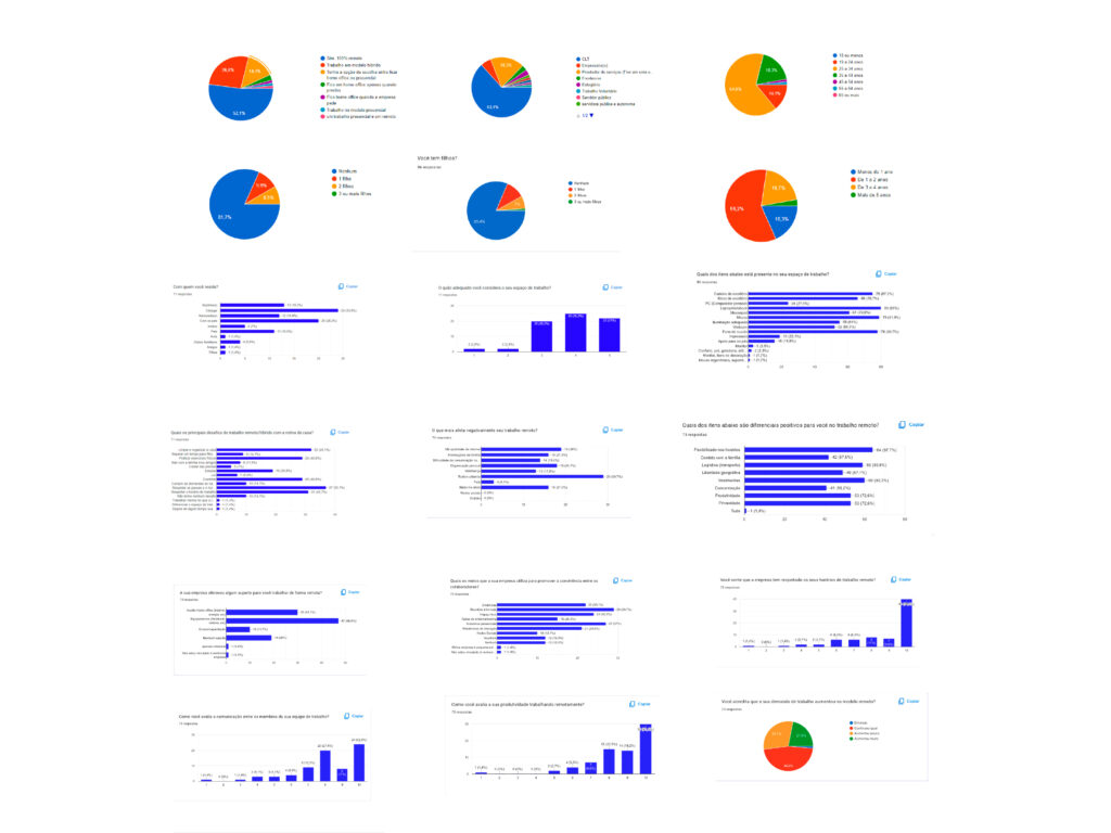
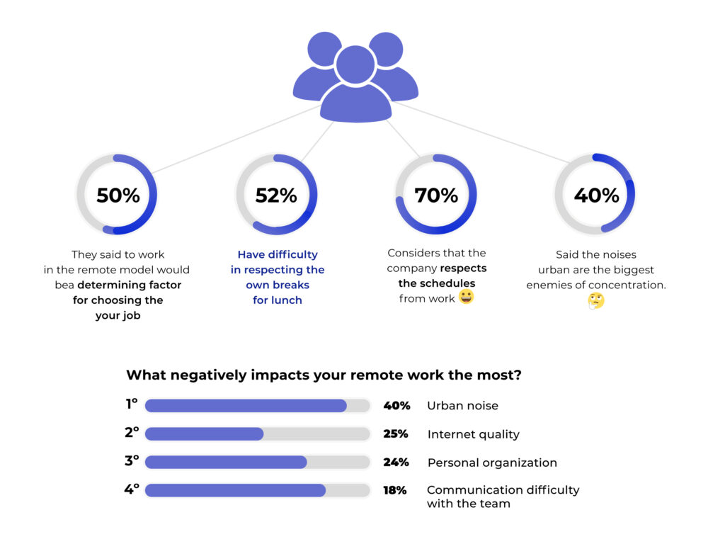
Quantitative Research (survey) The questionnaire was developed based on the certainties, assumptions, and doubts in the CSD Matrix. From the matrix, we discussed which hypotheses were considered important to be verified, which generated even more questions for the quantitative questionnaire.
The data obtained can be seen in the following graphs:
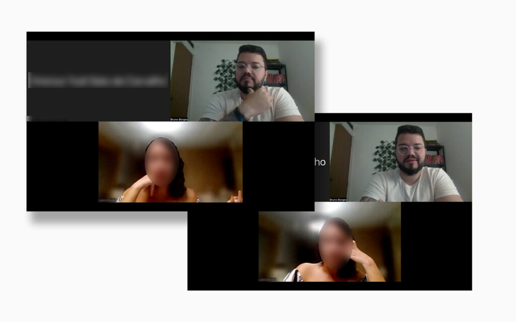
Qualitative research (user interviews) After completing the quantitative phase, we conducted semi-structured interviews with potential users, allowing for a more in-depth analysis of the data obtained previously. Our approach combined quantitative and qualitative research methods to gain a comprehensive understanding of user behavior. The results collected from both phases were used to guide the next stages of the project.
Affinity mapping and Debriefing
We conducted an affinity mapping exercise with the key data obtained from the interviews. This allowed us to compare the data from different interviewees to evaluate findings and identify common behavioral patterns among them.
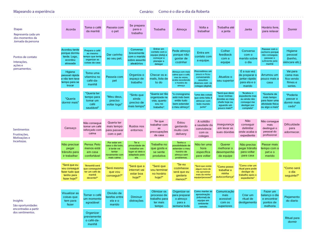
The debriefing process involved analyzing, grouping, and categorizing collected data. Based on this information, we were able to cross-reference data and better understand the needs and desires of our target audience. This led to the creation of our persona.
Persona After conducting quantitative and qualitative research to identify key users of a particular product or service, the collected information was used to create our main persona.
User Journey From the creation of our persona, we could map out their entire journey to understand how they went through the entire process within a specific scenario, and where problems and main difficulties appeared.
This was the convergence phase, which marks the end of the first and the beginning of the second diamond.
Ideation
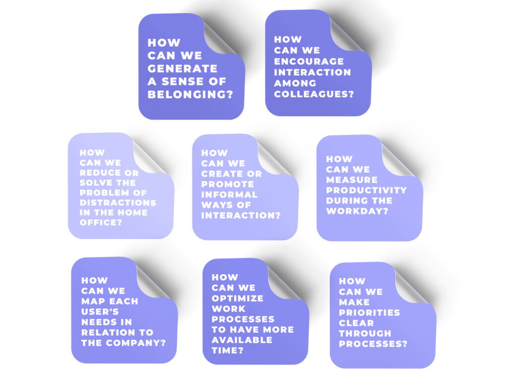
How might we We used the insights from our persona’s journey to create a list of questions using the “How Might We” technique. Then, we did a dot voting among ourselves and chose two insights to prioritize.
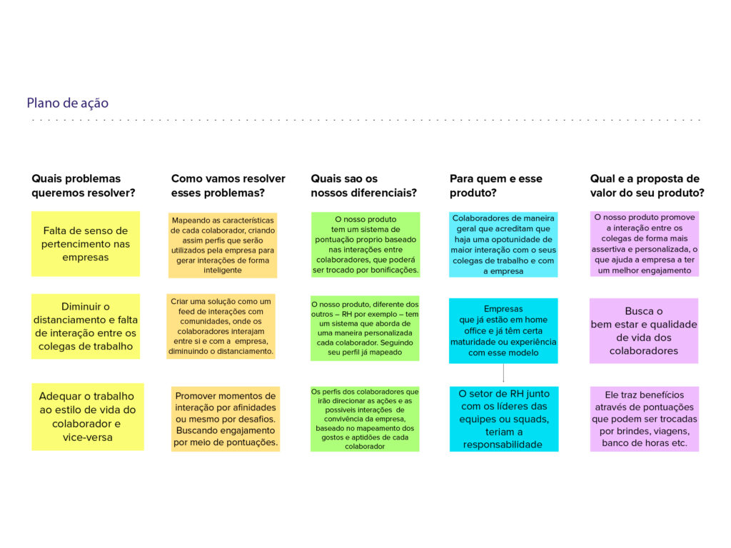
Action plan Based on the prioritized questions and insights, we developed a creative process and an idea matrix. Finally, we created our action plan which listed several possibilities for improving our project.
Solutions
Based on the problems and insights shown above, we have come up with the following solutions to compose the product:
1 – Create a solution like a community interaction feed, where employees can interact with each other and with the company, reducing the impact of distance;
2 – Promote moments of interaction based on common interests. Seek engagement through challenges that generate scores (gamification);
3 – Map the characteristics of each employee, thus creating profiles that the company will use to generate intelligent interactions.
Prototype
Sketches After we defined the solutions to our problems and what the actual app would be, sketches were created for the product. With all the drawings ready, the best ideas were discussed, and thus the most suitable solution for each screen was defined
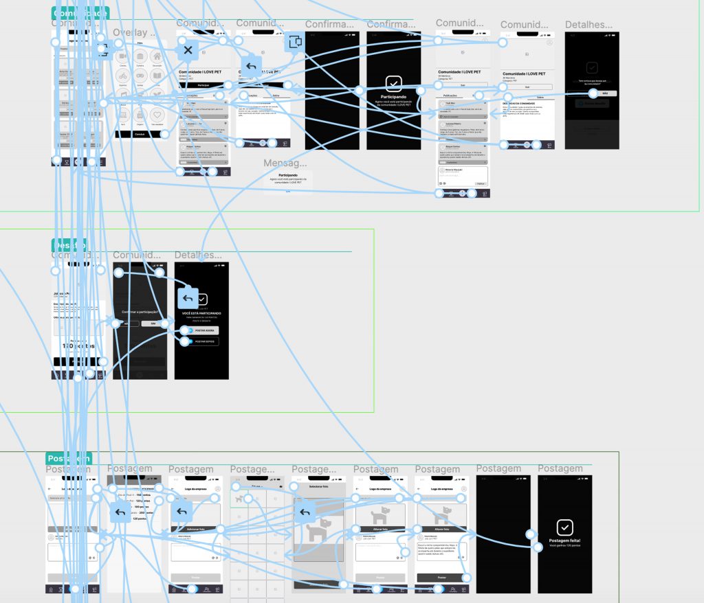
Wireframes
Based on the sketches created, it was time to build the app’s skeleton. Screens were developed with a medium level of fidelity, and then usability tests were conducted to validate the chosen solutions, assess and gather new ideas and improvements.
Usability tests
Before starting to create the high-fidelity prototype, it was necessary to validate the product with users. We then conducted some usability tests with 8 participants using wireframes in medium-fidelity.
After completing all the tests, we made the necessary adjustments based on the identified improvements. To prioritize these adjustments, we used a 2×2 matrix that took into account the criticality of the business and its importance to the user.
Steps of this stage:
1 – Usability test planning
2 – Recruitment of users
3 – Conducting the tests
4 – Collecting insights
5 – Analysis of collected data and insights
6 – Prioritization (2×2 matrix)
7 – Prototype adjustments
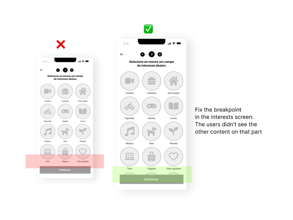
Iteration
During the iteration phase of the project, I conducted user tests to identify potential issues and improve the user experience. Based on these results, I implemented significant improvements in the prototype, including adjustments to the navigation flow, layout enhancements, and the addition of new features. The result was a more efficient and intuitive product for the user. Here are some of the improvements made in the app:
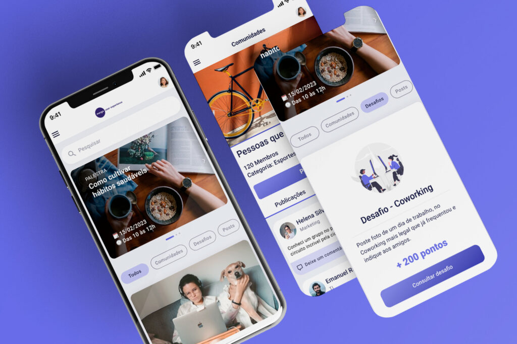
Introducing Wecon:
Wecon is much more than just an app – it’s a solution to improve the connection between people working remotely. Its intuitive and user-friendly platform allows employees to stay in touch with their peers in a relaxed way, by taking on challenges such as having a coffee together or sharing photos of their pets. Additionally, challenges offer prizes such as trips and shopping vouchers. Wecon is the perfect combination of the convenience of working remotely while maintaining productivity and connection with colleagues.
Styleguide
We used Google’s Material Design 3 as a base to create the app’s styleguide. We also made some modifications that we deemed necessary to adapt to the needs of our product.
Logo
Colors
We conducted a dot voting among the team members and arrived at the following adjectives that we wanted to convey with our app: communication, optimism, trust, and creativity. Additionally, we also used the “Colours in Cultures” guide as a reference to guide us and inform us if the chosen colors were in line with our users’ region or which chromatic variations we should choose. This way, we aimed to develop a visually appealing and culturally sensitive app for our users.
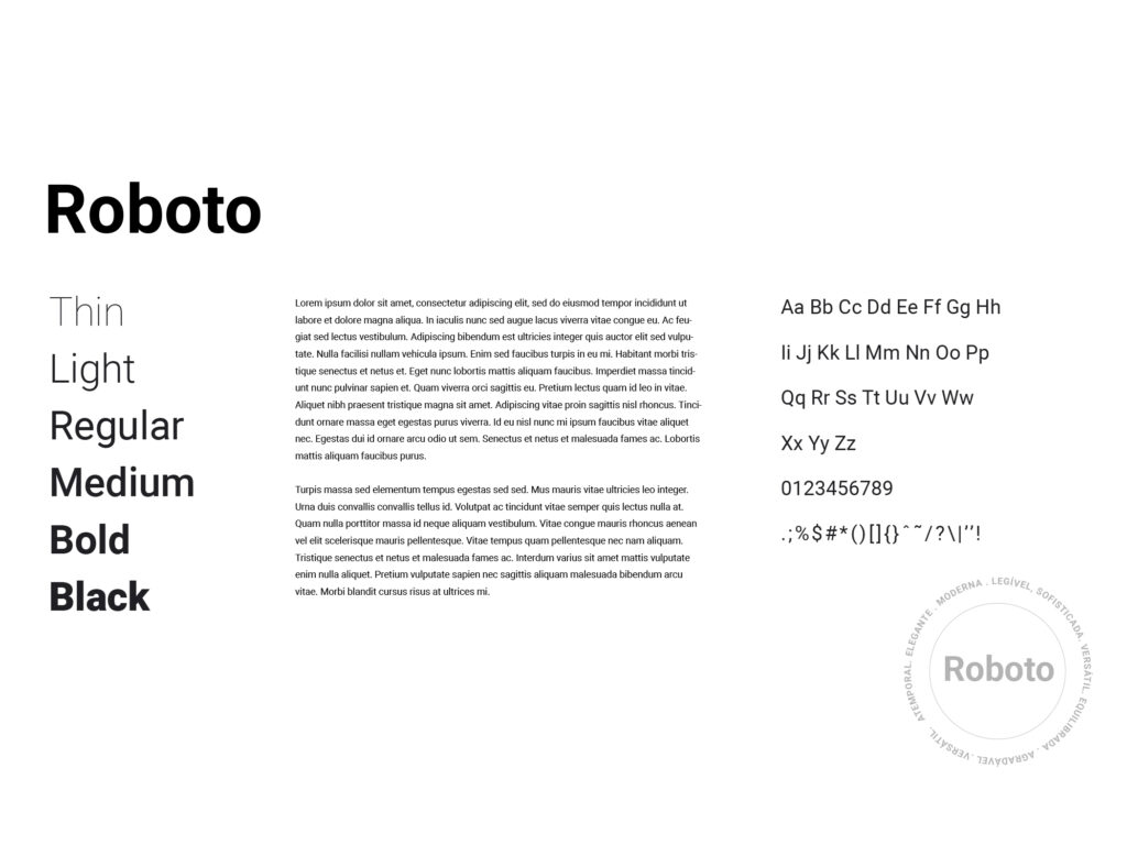
Typography
As Material Design was chosen to guide the creation of our product, we kept the Roboto font which is recommended by Google’s design system. It’s a font that was specifically created for use on mobile devices and user interfaces, and is known for its clarity, readability, and modern style which perfectly met the needs of our product.
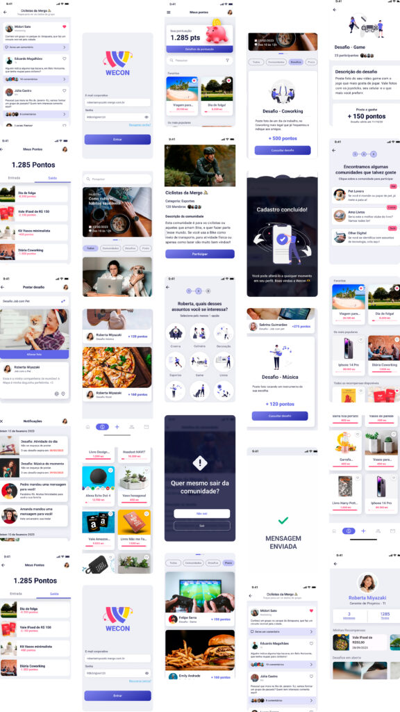
Final Design
Check out how the prototype turned out byclicking here
During the usability test, Participant 1 described the new interface as being easier to use and visually appealing compared to the first version.
“I would love to have a tool like this in my everyday work,” said Participant 3.
In retrospect
Acting end-to-end, I realize how much I learned and evolved during the project. I distinctly noticed the importance of involving users at each stage of the design process, from initial research to final product evaluation.
Through user research and testing, I was able to gain a deeper and more precise understanding of their needs and expectations. This understanding was critical in developing more effective and satisfying solutions for them.
One of the most interesting aspects of this project was the shift in focus from other work I had done previously, such as visual design. In this project, my top priority was ensuring that the users’ and businesses’ needs were met, even if it meant a less attractive appearance for the product. Of course, visual design was also considered, but the priority was always resolving user problems and achieving business objectives.
This experience taught me that, to be a good UX designer, you must be willing to set aside some of your aesthetic preferences in favor of user and business needs. This does not mean that the visual aspect should be neglected, but rather that it should be developed in conjunction with other design areas to meet all project needs and goals.
Another valuable lesson I learned during this project was the importance of collaboration within the team. It was essential to ensure that the product met user needs and business objectives and reduced bias.
Finally, this project taught me the importance of being open to learning and evolving as a professional. By experimenting with new design techniques and tools, I improved my skills and became a more well-rounded and prepared UX designer to face new challenges.
Thanks!
This project was developed in collaboration with the members of my team and presented as the conclusion of two courses I was attending in 2022: Design Circuitand Mergo. Through this experience, I had the opportunity to work in a team and apply the skills and knowledge acquired in the courses to a practical and challenging project.
I would like to express my gratitude to teammates Yudi Sato, Lary Ribeiro, Mariana Pedrotti, and Nayara Matos, whose collaboration and support were fundamental to the success of this project. I also want to thank teachers Edu Agni (Mergo) and Apparicio Jr.(Design Circuit) for their guidance, valuable content, and countless classes that enriched my knowledge of UX Design.