Improving a responsive website for an internet provider (Telecom)
This Project is an UI (User Interface) project and the main objective here was to keep the product pages (mobile and desktop), that were designed previously, (MVP) but not structured enough for the client and development team. The website was already online but incomplete.
1. Project steps
01 – Kickoff Meeting with the client to define objectives and manage expectations. (above described);
02 – Search Searching for visual references to increase my repertoire of similar products;
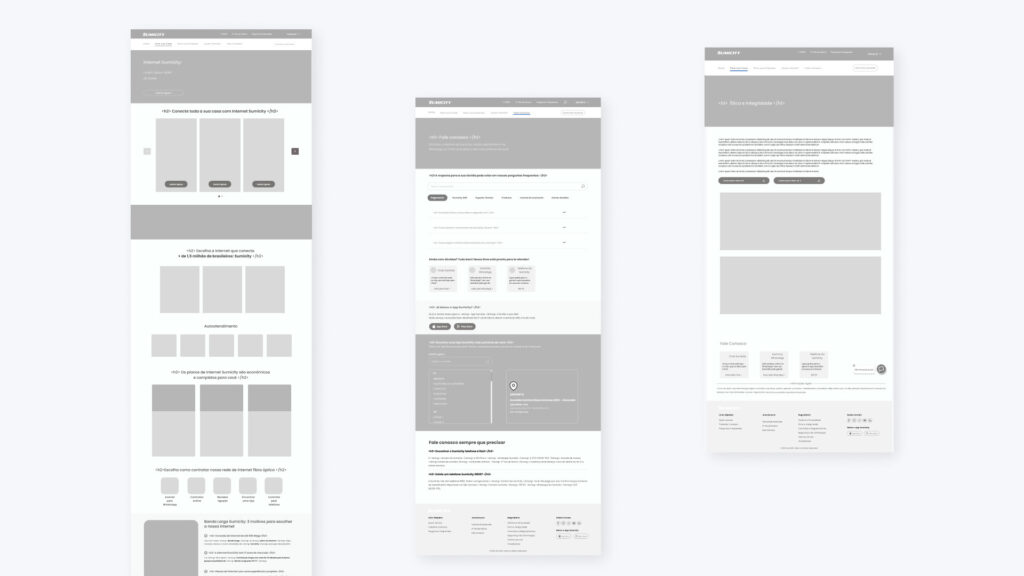
03 – Wireframes Organization of the pages and contents of the website;
04 – Details Definition and creation of the entire style guide
05 – Final design To create navigable pages in high fidelity and with animations, similar to what the user will see on the website.
06 – Learnings
The data collected is confidential and cannot be disclosed
2. Search
Here are some products that were sought as a reference to reduce the user’s learning curve,as suggested by Jacob’s Law.
3. Wireframes
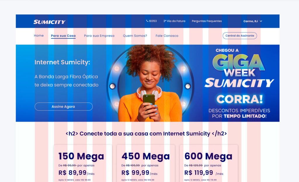
Specifically for this project, the wireframes were projected based on a previous container. So I wasn’t free to change this. The positive side was a faster design and development. The new layouts were created in a low-fidelity wireframe and in high-fidelity navigable prototypes.
4. Details
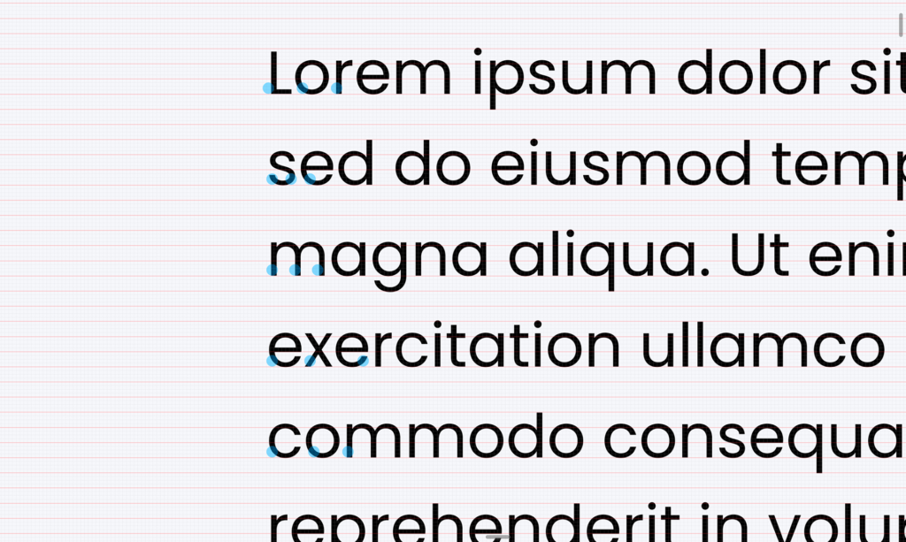
Typograph
The typographic family had already been defined based on the client’s brandbook and was related to the brand’s strategies.
So, my work in terms of typography was to define a good vertical reading rhythm and create two complete style sheets: one for mobile and one for desktop, because until then there was no such distinction.
For this, I used Google Material Design to help me and adjusted the details using a 4-point grid to adjust the baseline.
Microinterations:
To make the site more dynamic, and to make a positive impact on the user experience, some microinteractions were designed, based on the practices described by Dan Saffer in the book “Microinteractions: Designing with Details”: Trigger, Rules, Feedback e Loops & Modes.
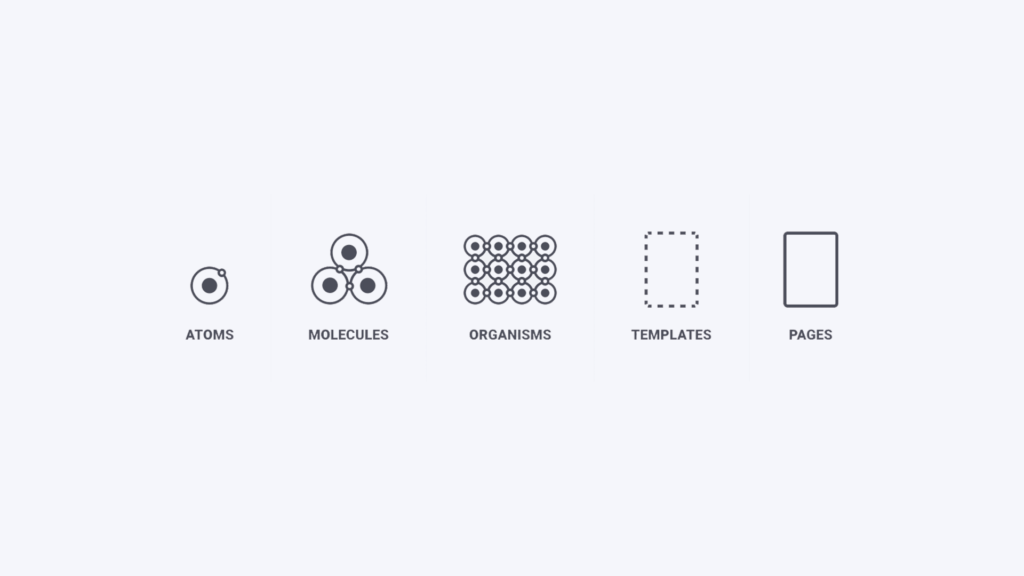
Atomic design:
The principles of Atomic Design developed by Brad Frost were applied, with the purpose of creating a layout in a modular way to have a scalable and agile design.
Below there is an example of how this technique was used in the project:
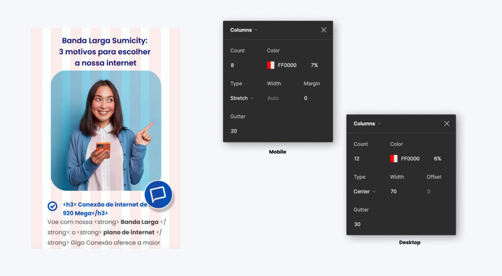
Grids:
In order to keep the layouts more harmonious, concise, and well-distributed, two types of grids were used in the project.
The development team thought of the setting choice and fits better with the site that was live and with the objective of the project.
This was definitely a project I enjoyed being a part of. There was a lot of collaboration between all the stakeholders involved and it was an amazing experience to see the whole project taking shape every time the development team implemented the pages.
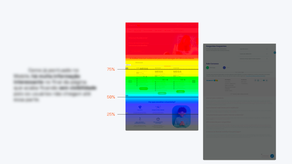
Unfortunately, my part in the project was just projected the UI Design and we didn’t have the budget and time to run tests to verify the usability and the heatmap-based improvements. My deadline was November 2022, to complete and deliver it.
Some numbers (similarweb.com):
– 5% increase in website organic searches; – 17% increase in the average time the users browse the website – 89% increase in Whatsapp API usage
However, the customer’s expectations were met and the feedback was positive. As a result, we delivered a functional website aligned with the product business objectives.
7. Next steps
I understand that there was a lack of processes throughout the project, but that did not make it any less challenging.
On the contrary, it made it even more challenging, because I knew I had to create with little margin for error. And, as a whole digital product is never complete and it is always necessary to make continuous improvements, I put below what would be the next steps in my opinion:
1 – Create a new heatmap to find out how the user’s click patterns are and if the previous one has really been improved with the new website;
2 –First click and 5-Second test to measure the user’s first reaction when entering the site and what happens in the first seconds of navigation;
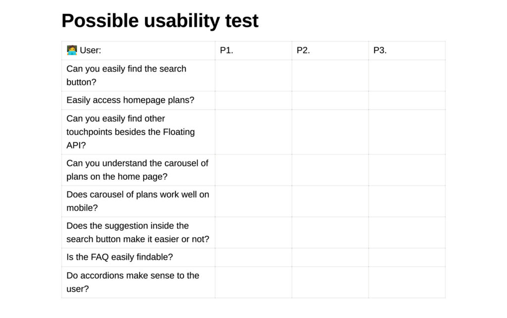
3 – Usability tests to evaluate the new components inserted or removed and some assumptions;
4 –Heuristics audit
After these processes, there would certainly be some points of improvement to implement and the product would enter the iteration phase to later do new research. To iterate, I could be used some prioritization methods like Now-Next-Later: Now (<3 months), Next (3-6 months), Later (>6 months).